
Hey! I hope
you had great Easter time. For me as always it was a productive month... Okay
maybe I still can’t use Snapchat and I didn’t show my Calvin’s underwear online
but at least I spent weeks on drawing Kanye West portraits for Live Mag, had
short project adventure with Tinxr brand and finally finished my first season
of print collection at work and I totally can’t wait to see it at shops. Have a
great start of the spring guys, and don’t forget to check these super talented
people below:
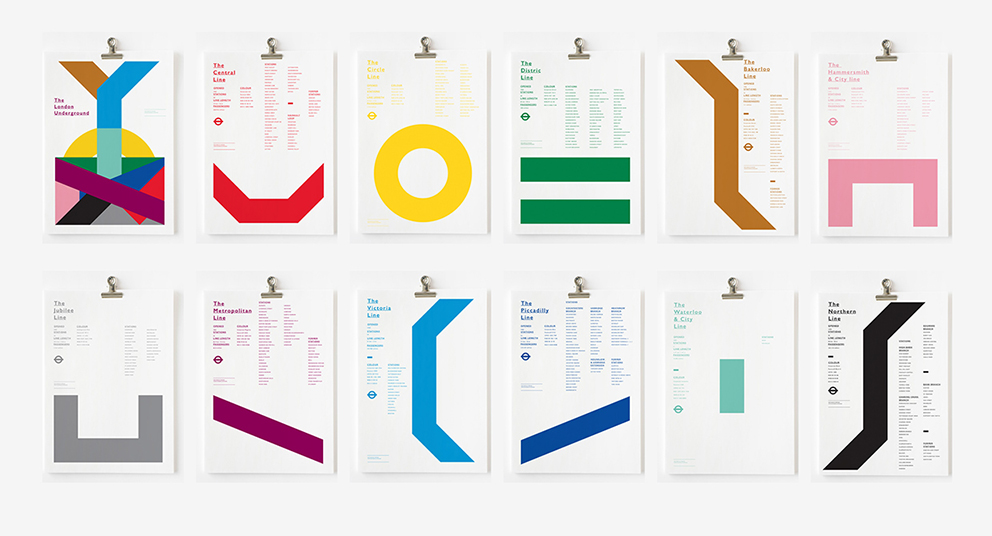
#1 London Underground by Nick Barclay
Yes, it's a freaking awesome visualization of London Underground plan and I totally fell in love with this project. Simplicity and clever composition is all I need in commercial graphic design. Necessarily take a look at whole Nick's portfolio and check the rest of my favourites: Circle Movies and Depression.
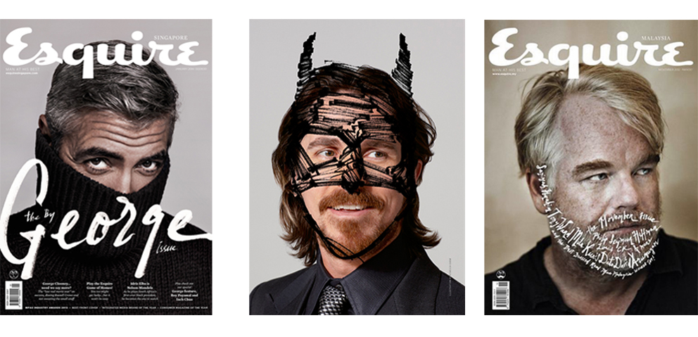
#2 Eaquire magazine by Rebecca Chew
Meet Rebecca - art director of my favourite Eaquire editorial designs. Minimal handwriting text and sketchy details always make a thing. No more words are needed, just enjoy her -> website.
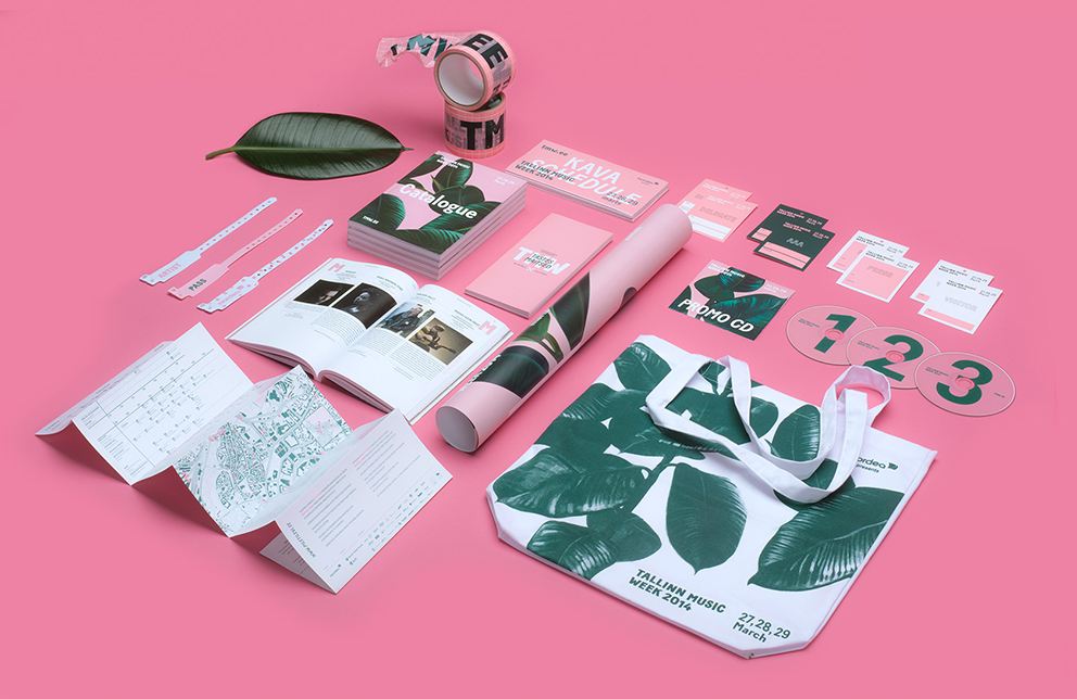
Hypnotizing pink joined with minimal text and beautiful illustrations means identity design for Tallinn Music Week 2014 created by AKU. I've always been a huge fan of simply, clear graphics projects (maybe because I never use it in my works ;) ) and this one fits my taste perfectly.
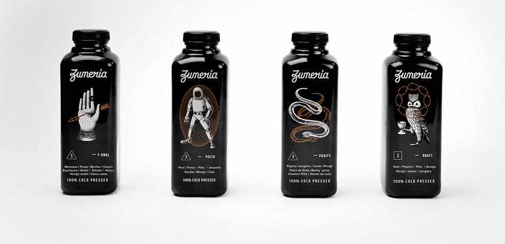
#4 Zumería by Estudio Yeyé
Darkness and mystery is always enough to make me happy. Below you can see effect of Mexican design studio collaboration with Zumeria- Raw Juice Bar. Dark tones and illustrations inspired by eighteenth century figures create unique and consistent look between the products and the whole place interior. Good job guys!
No comments:
Post a Comment